If you have a summer family session coming up — whether it's a golden-hour beach shoot, an open field at dusk, or a breezy coastal park — this palette was basically made for you. The Shoreline Memoir palette blends sandy gold, muted slate blue, soft peach, and a warm cream that together feel like the last hour before sunset looks in a photograph. Not too precious, not too matchy — just that easy, lived-in warmth that reads beautifully when everyone's laughing and the light is low.
What I love about this combination is how naturally it sits on real families. There's a softness to these tones that doesn't demand perfection. A toddler can get grass on their shorts, a baby can lose a bow, and the palette still holds together because none of these colors are fighting for attention. That's exactly what you want when you're chasing candid moments instead of posed ones.
The Shoreline Memoir palette is built for summer — specifically for families who are shooting outdoors in open, light-filled spaces. Think coastal dunes, tall grasses along a tidal marsh, an open field just before golden hour, or even a sun-drenched backyard with a warm fence line as your backdrop. It's a palette that genuinely thrives in summer's most flattering light — that warm, directional glow you get in the hour before sunset. If you're booking a session between mid-June and early September, and your location has any kind of sandy, open, or waterfront quality to it, this is one of the most reliable palettes you can choose.
It works especially well for families with young kids and babies — the soft peach and honey gold tones are among the most universally flattering shades for little faces in warm light, and the muted slate blue gives dads and older boys something that feels grounded and easy without reading dull. Expecting mamas love this palette too. The peachy-warm tones are generous and soft against a range of skin tones, and the relaxed silhouettes that work for bump-friendly dressing — flowy midis, tiered skirts, smocked waistlines — happen to be exactly what photographs best in an outdoor summer session anyway.
Here's what I want photographers to really understand about this specific color story: sandy gold, muted slate, and soft peach are all mid-value, low-saturation tones — and that is a gift to work with. They don't blow out in direct sun the way bright white does, and they don't swallow the light the way navy or black can. In golden hour, the sandy golds and honeys pick up that warm backlight and almost seem to glow from within. The slate blue acts as a natural complement — it reads cooler against warm skin and warm backgrounds, which creates visual interest without anyone having to think about it.
On camera, matte fabrics — linen, gauze, cotton, chambray — render the tones in this palette faithfully. A silky or synthetic fabric in the same sandy gold shade will pick up specular highlights and read shinier than it looks in person, which can flatten the image. Natural fibers also move more honestly in a breeze, which matters on a beach session where that flutter adds life to a still frame. The soft cream is the secret anchor in this palette — it bridges the warm golds and the cooler slate tones so the family reads as a cohesive unit without being too matched.
Picture a late-afternoon coastal session — the kind where the family arrives a little sun-kissed from their day at the beach, the toddler is barefoot before you've even said hello, and the light is already starting to soften and angle low. Mom is in a flowy sandy gold maxi that moves every time she scoops up the baby. Dad is in a muted blue linen shirt and warm khaki shorts, relaxed, easy. The kids are in soft peach and honey gold that catches the light exactly right when they're running toward the water. That palette — those warm and coastal tones — reads like the afternoon actually felt. Not styled to the point of stiffness, but intentional enough that every frame looks cohesive.
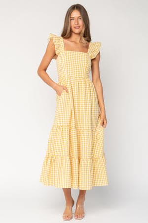
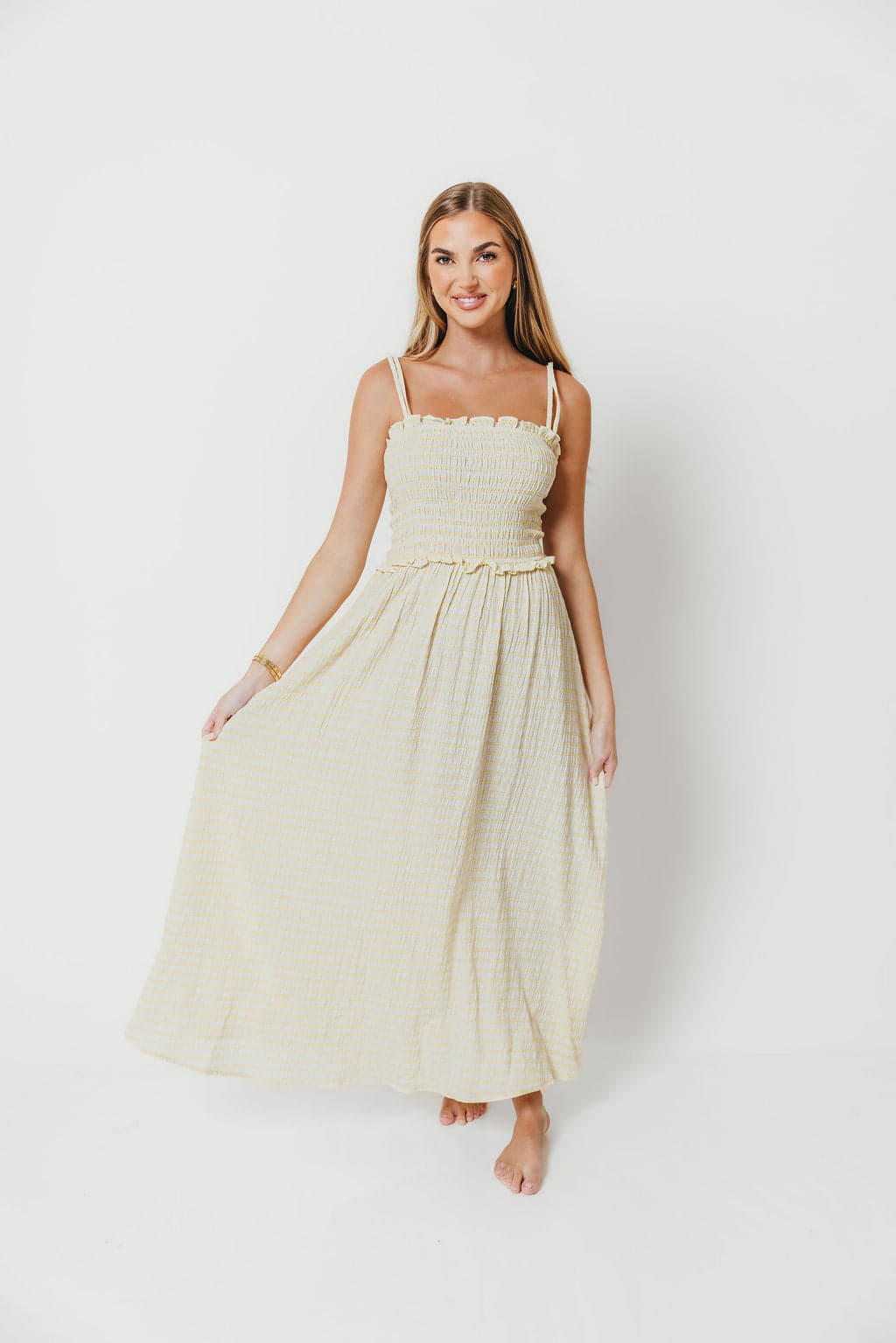
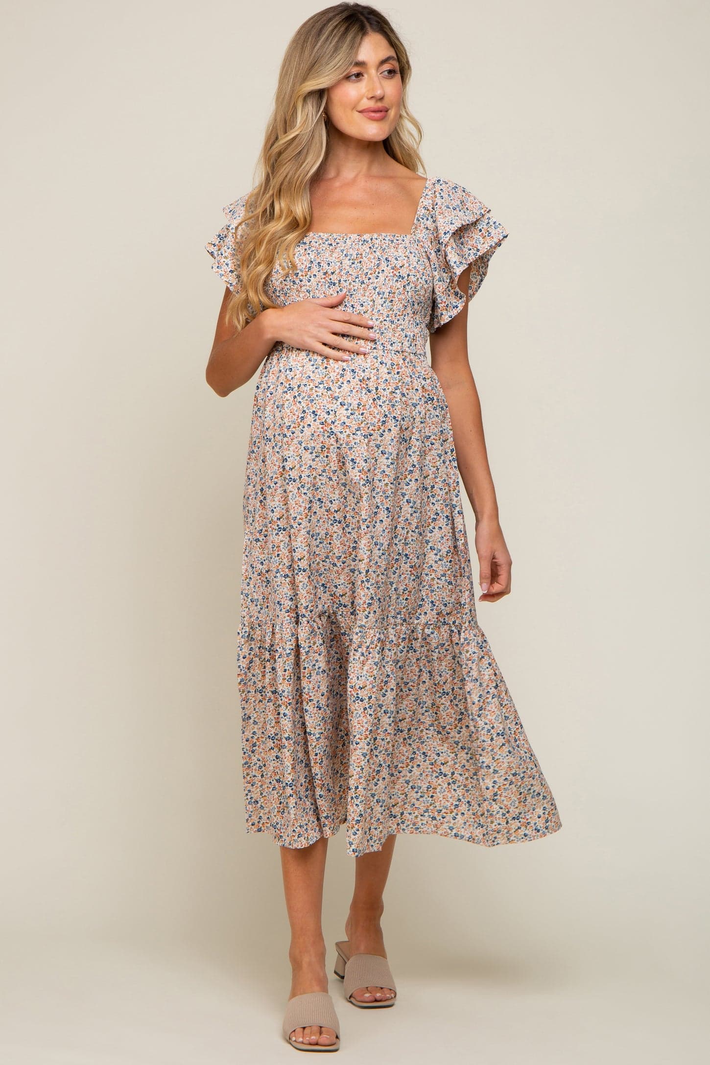
For Mom, I'd start with a gingham maxi dress in a warm golden-amber tone — the kind with a relaxed, slightly flowy silhouette that moves beautifully in open air and doesn't require any particular body type to pull off. The gingham adds just enough texture to be interesting in a photograph without introducing a pattern that fights with other pieces. Pair it with simple tan sandals and you're done — this is the kind of look that photographs itself. If a gingham isn't your style, a flowing midi in soft sandy-coral tones with a subtle smocked waist is a wonderful alternative, or consider a tiered maxi with a flutter sleeve in a warm cream if you want something even easier to style around.
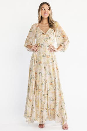
If Mom is expecting, a bump-friendly midi in that warm peach-and-gold tonal range is genuinely one of the most flattering options in summer light. Look for something with a cotton construction and a ruffle or flutter detail — those soft edges photograph so gently, and the movement adds dimension to the silhouette. An option in muted warm neutrals with small floral accents is another beautiful choice that works with the whole palette.
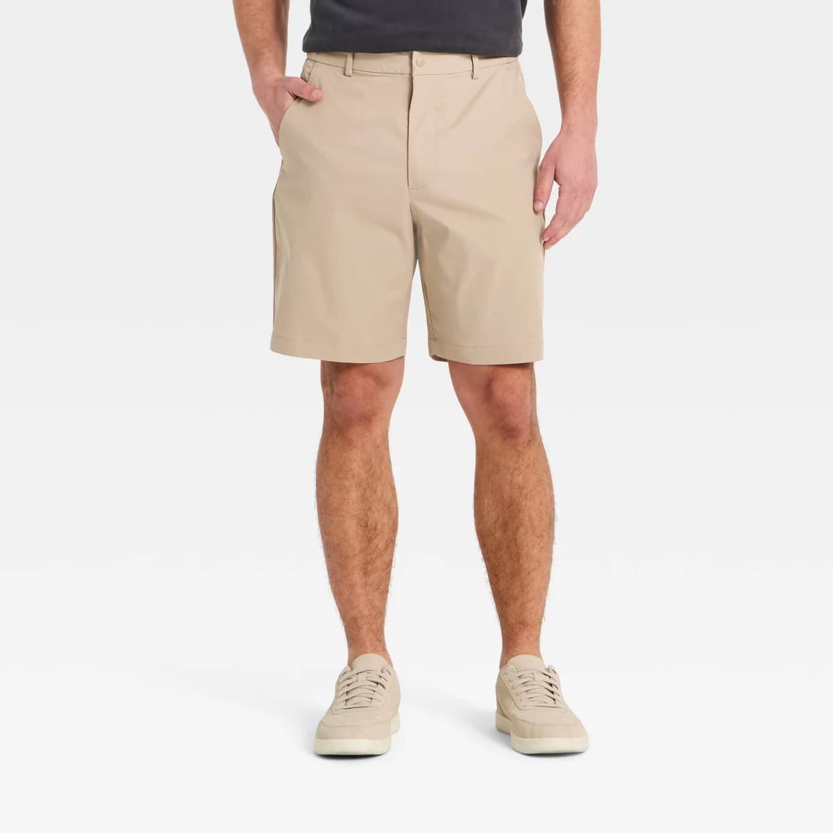
Dads are the piece of the puzzle I spend the most time convincing clients about — and the solution is almost always simpler than they expect. A linen camp-collar shirt in a warm sandy or natural linen tone is about as close to a foolproof summer session option as exists. It's relaxed enough to feel like him, intentional enough to look styled, and the linen fabric reads soft and textural on camera in a way that cotton basics sometimes don't. Pair it with relaxed-fit jeans or khaki shorts and he's exactly right. The linen camp shirt in the warm sandy-gold and coral range is especially good for this palette — it anchors him in the warm tones while the cooler slate and peach hues work around him.

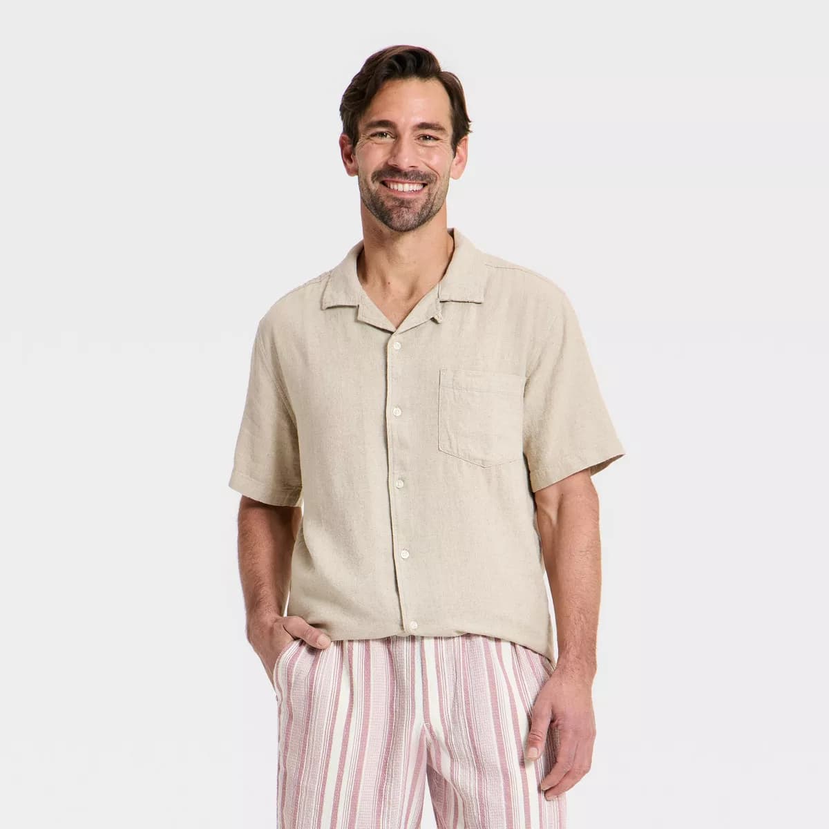
If he wants to lean into the cooler slate side of the palette, a muted blue comfort polo or short-sleeve button-down works beautifully paired with warm khaki chino shorts or relaxed warm-wash jeans. Just make sure the bottom is a neutral — tan, khaki, warm-wash denim — rather than a second palette color. That contrast is what makes the outfit read as styled rather than coordinated-to-a-fault.

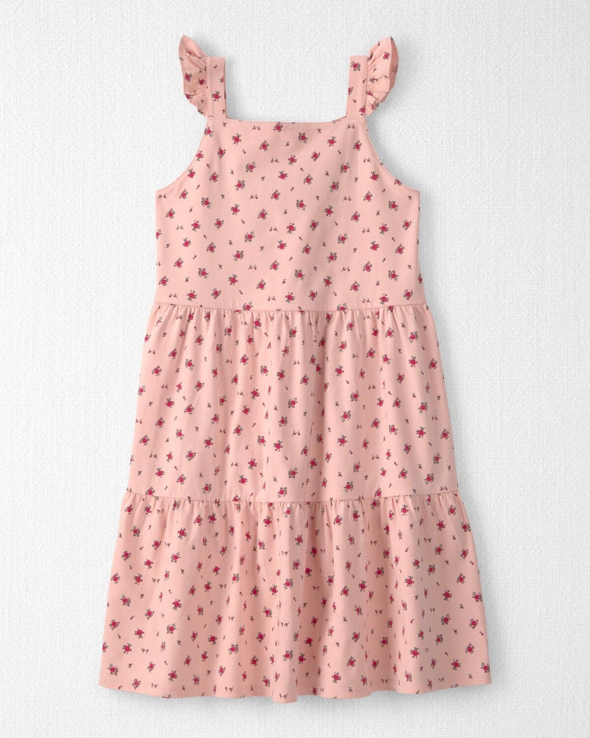
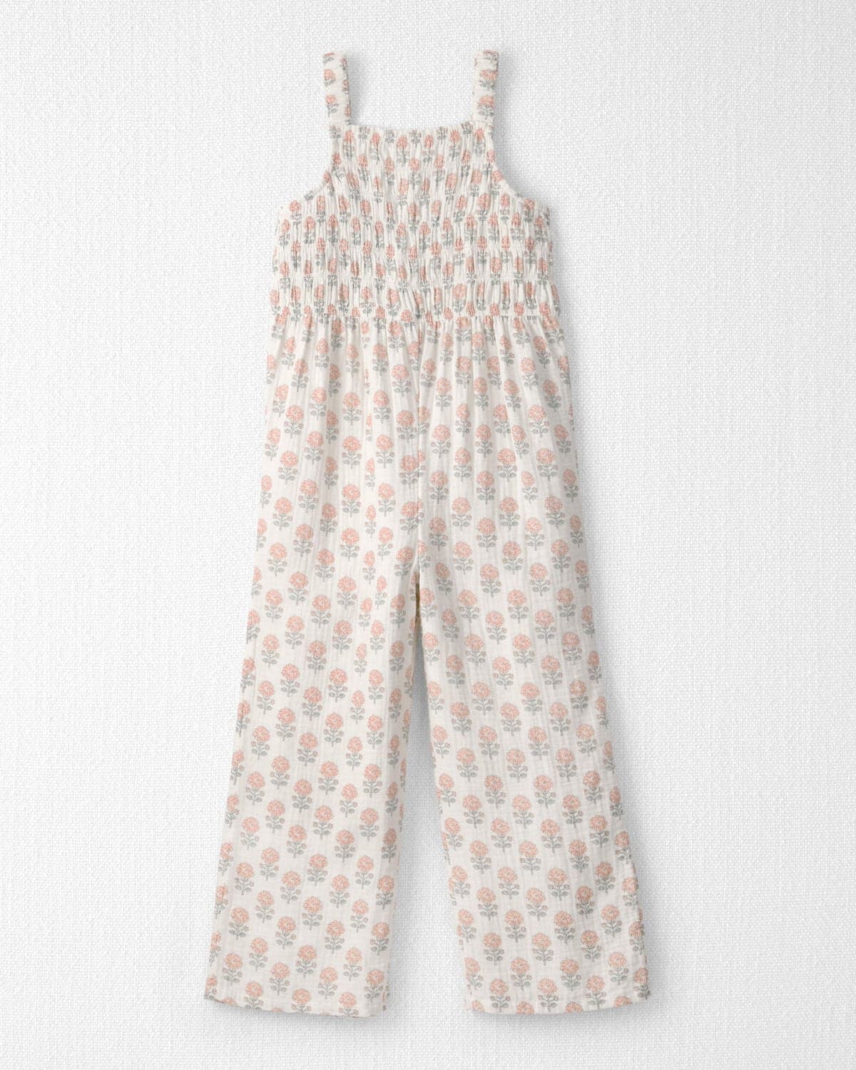
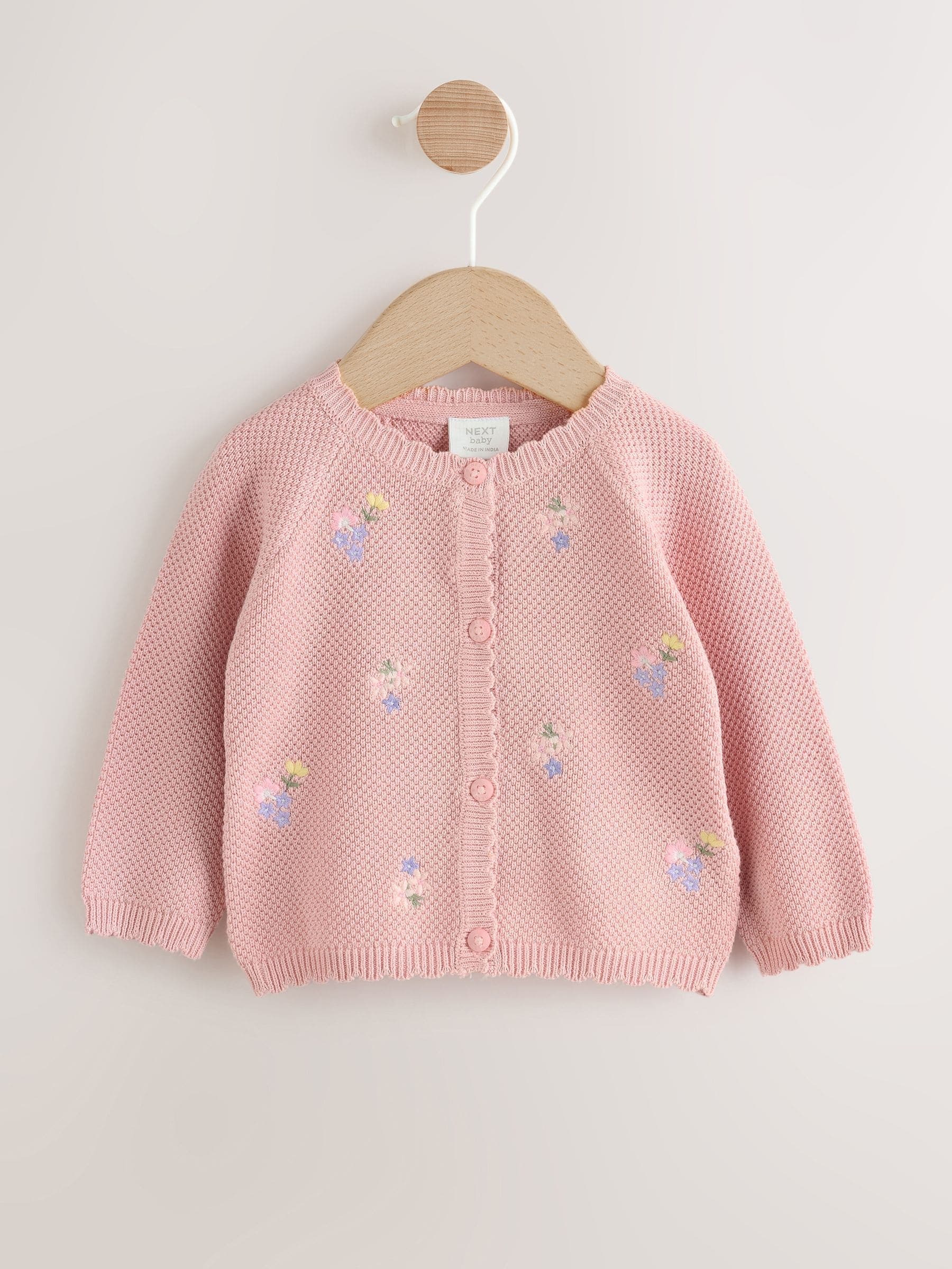
For girls, the tiered cotton dress in a warm soft coral-peach is a natural fit — it's lightweight enough for summer heat, the tiered layers photograph with great movement, and the color sits right in the heart of this palette. Older girls can wear it with simple neutral sandals; younger ones look sweet in it barefoot. If you want an alternative with a bit more visual texture, a smocked dress in sandy-warm tones or a cotton gauze gauze jumpsuit in cream are both lovely options that hold their own against a coastal backdrop.
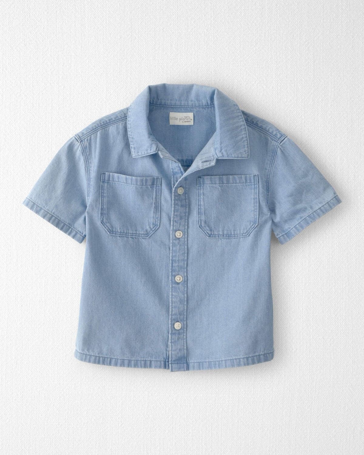
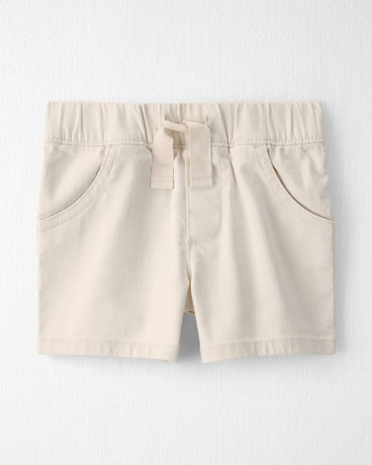
For boys, a chambray button-down top in the slate-to-denim range paired with organic cotton shorts in a soft neutral is a combination that holds up to a full session — including the part where they inevitably find something to climb. A short-sleeve henley in muted slate or blue tones works just as well if you want something simpler. The key is keeping the shorts a neutral: khaki, warm-wash tan, or soft gray rather than a second saturated color.
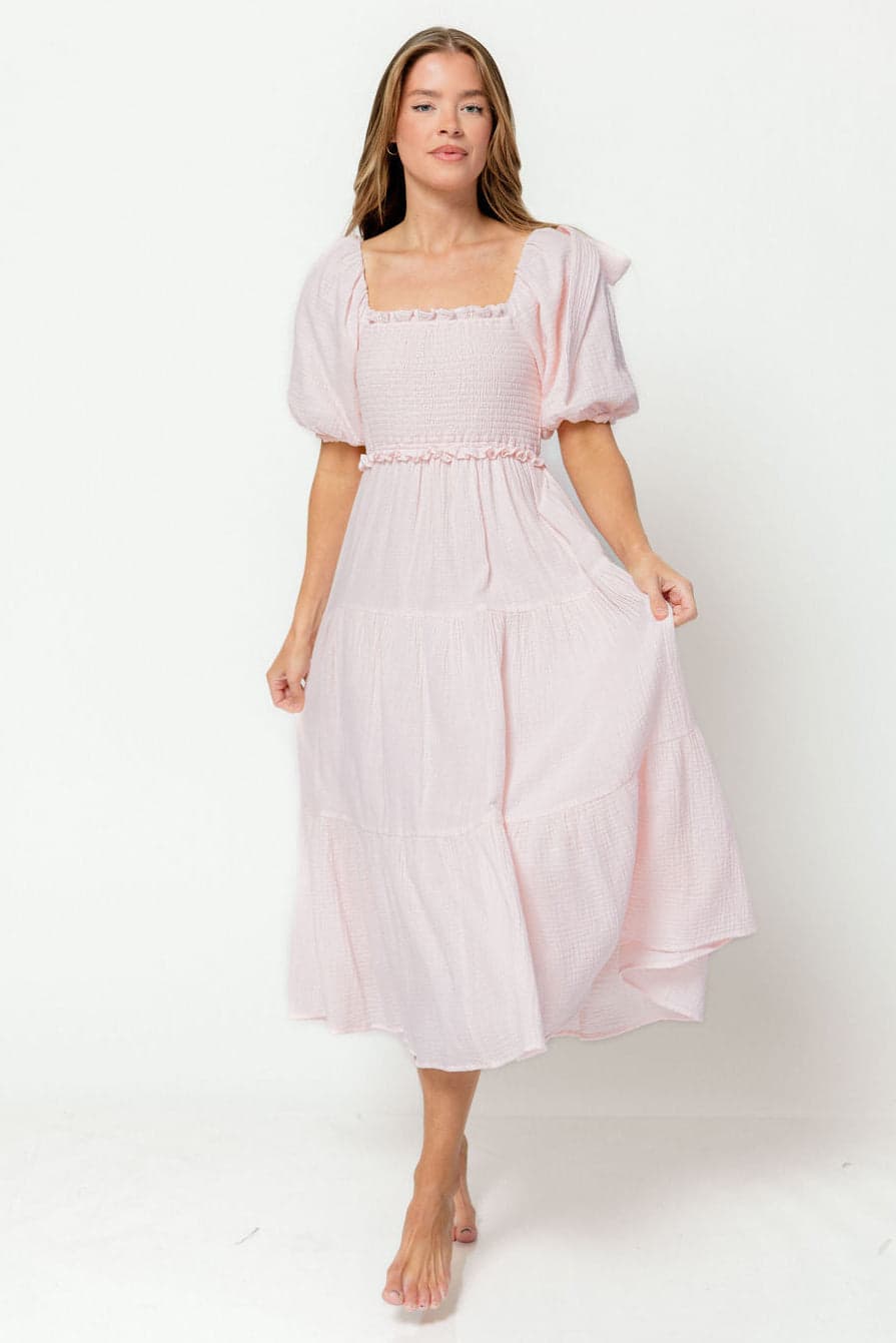
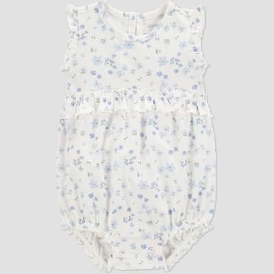
Babies are honestly the most fun to style in this palette. The soft peach and floral tones in this range are some of the most beautiful shades to photograph against golden-hour light — they warm up beautifully without going orange. For baby girls, a soft floral bubble romper in blush and warm peach tones is an easy yes, and it layers perfectly with a light cardigan in sandy gold or dusty rose tones for the cooler evening air. A smocked organic cotton dress in warm cream is a beautiful alternative if you want something a little simpler.
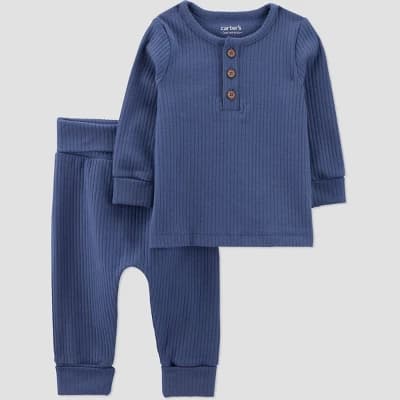
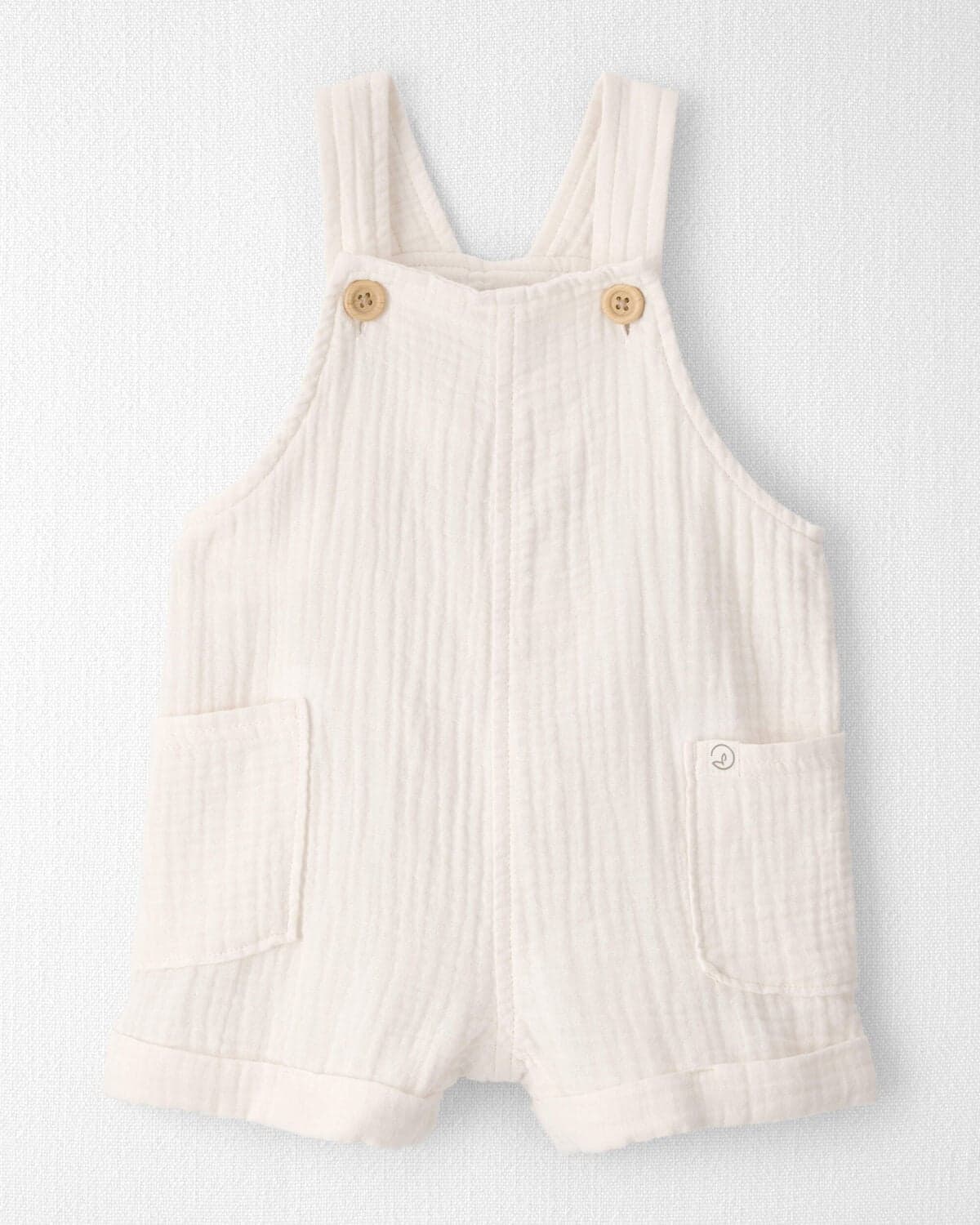
For baby boys, a knit set in a deep slate blue or a stripe romper that nods to the cooler side of the palette ties them into the overall family look without making a tiny baby look overdressed. An organic chambray shortall in cream or warm tan keeps things relaxed and comfortable — which matters a lot when you need a baby to be happy for an hour.
Bright white, neon, and highly saturated primaries will fight the softness of this palette immediately. Pure white reads as a different color story entirely in golden-hour light — it blows out and draws the eye away from faces. True red and bright orange sit outside the warm-peachy range this palette works in, and emerald or electric blue will cool the whole image in a way that clashes rather than complements. Stick within the muted, mid-value range.
Synthetic fabrics — polyester satin, shiny jersey, anything with a sheen — will pick up specular highlights and reflect the light in a way that flattens the image and misrepresents the palette's softness. Stiff dark denim is hard to drape naturally when a family is seated on the ground, and it reads too heavy against these warm coastal tones. Lean toward linen, gauze, chambray, soft cotton, and matte knits — fabrics that breathe in the heat and move honestly when the wind picks up.
Tight stripes and fine checks can cause a moiré effect on camera — that shimmer or interference pattern that looks nothing like the actual fabric. Large graphic prints and character tees pull the eye away from faces and break the visual cohesion of the group. Bold plaid in high-contrast colors is a similar problem. If patterns are part of the plan, keep them loose and organic: a soft gingham, a small floral, a subtle texture — nothing with a tight repeating line.
Bulky metal watches, sport sandals with thick rubber soles, and light-up shoes all work against the relaxed, natural feel this palette is meant to create. For kids especially, try to swap athletic shoes for simple canvas sneakers or sandals — the visual weight of a running shoe draws attention downward in a way that's hard to compose around. Keep jewelry simple and warm-toned: small gold studs, a delicate chain, nothing that catches and flares in the light.
Not exactly — but you should all wear colors that belong to the same family. With this palette, everyone pulls from the sandy gold, muted slate blue, and soft peach range, which creates cohesion without looking like you ordered matching outfits. One or two people can wear a neutral cream or warm denim to anchor the palette.
Flowy midi and maxi silhouettes are your best friend — they're comfortable in summer heat, they move beautifully in outdoor light, and smocked or elasticated waists mean no awkward fitting. The warm peach and sandy gold tones in this palette are especially flattering for baby bumps in golden-hour light.
A plain-color tee absolutely works — a soft crew-neck in muted slate or warm cream is a great low-effort option. The key is keeping it solid and in the palette's color range. Graphic tees with large logos or text pull the viewer's eye away from faces and can date a photo quickly.
Think smart-casual: one step above what you'd wear to a nice family dinner, but nothing you'd be afraid to sit in the grass or chase a toddler in. Flowy dresses, linen shirts, and relaxed chinos hit that sweet spot — dressed enough to feel intentional, comfortable enough to actually enjoy the session.
More than most families expect — especially for seated poses and any shot that includes feet. Simple sandals, canvas sneakers, or leather slides in neutral tones keep the eye moving upward toward faces. Sport sandals, chunky platforms, and light-up shoes tend to anchor the image in a way that works against the palette.
Pick the battles that matter most — usually Mom and the oldest child, since they're most visible — and give the younger ones a little grace. As long as the colors fall within the palette's range and the fabrics are soft and natural, even an imperfect outfit reads well when the light is good and everyone's laughing.
When you send this palette to clients, I'd encourage you to frame the muted slate blue as the anchor for the guys and the sandy gold and soft peach as the range for the women and littles. That natural warm-cool contrast in the palette is what makes the whole group read as cohesive without being matchy — and it gives you a built-in visual balance in wide group shots. For the beach or open-field version of this session, schedule for the last 60-75 minutes of daylight. These sandy and peach tones absorb warm backlight beautifully, and the slate blue cools down just enough to complement rather than compete. If the light turns overcast, don't panic — the low-saturation values in this palette are forgiving in flat light too. You'll lose some of the glow, but the softness holds.
Planning your own family photos?
Browse more palettes and what-to-wear guides on the Shutterstyle blog.
See more palettes →Styling clients as a photographer?
Save these pieces into a shareable client style guide your clients will actually follow.
Build a guide in 5 minutes →Is this the palette for your session? If you're still working through the options — or trying to figure out how to actually get everyone dressed — that's exactly what Shutterstyle is for. Come find your fit.